
Irresistibly Yours Designer Series Paper

Doesn't look like much, I know!
But you are going to love this paper! It is being offered as one of the free selections in this year's Sale-a-Bration brochure!
The paper is 12 x 12, and each sheet has a glossy white design on white card stock. Glossy areas will resist ink once applied ("emboss resist"). Therefore, you can customize this paper any way you want!
There are six different designs and two sheets of each. That gives you plenty of area to cut down and to use on your cards or scrapbook pages.
In my last post I included this as one of the two most popular free selections this year. THIS IS MY PREDICTION, as I just love what you can do with this paper, and I think you will too!
Let me show you how to use it first. Then, I will showcase each pattern in use on cards that I have created.
HOW TO COLOR YOUR IRRESISTIBLY YOURS DSP:
After doing my research (as I always do) by scouring Stampin' Up!, Pinterest and YouTube for other demonstrators and what they're doing, AND THEN TRYING IT FOR MYSELF, these are the best ways I have come up!
#1 Stamping Spritzer
•Fill a spritzer bottle with rubbing alcohol and add drops of ink refill to achieve your desired color.
•Spritz paper lightly from a distance of about 5 inches.
•(As with other methods) you'll want to have a paper towel or tissue nearby to remove excess ink from glossy areas.
**The paper will not hold an excessive amount of water! Spritz lightly!
**This method works well with different colors being used and you can alternate the intensity of the spritzing!

If you want even, intense color - this is the method you should use!
** Remember when using a brayer be sure to ink it and use it rolling, repeatedly, in ONE DIRECTION! Going back and forth only uses about 1 inch of your roller - think about it!

#3 Sponge
(MY FAVORITE!) It doesn't matter if you prefer a sponge or a dauber - just apply ink until desired color consistency is reached and wipe off excess.
In the picture below, I have done the left-half of the strip of paper with a brayer and the right-half with a sponge dauber:

(#4) Blendabilities alcohol markers
I put this method in parentheses because I'm not 100% sure about it - try it if you like it!
•Just scribble on the DSP with your marker and then wipe.
A couple things I found with using the Blendabilities method to color DSP are:
1) The glossy areas absorb some of the marker color and do not, when buffed, completely reveal bright white. (Some demonstrators are saying, though, that if you apply it and quickly wipe away excess you will get white!)
Here is a picture compared to the brayer/sponge so you can see the difference in the glossy areas:

2) If you do not color in the same direction you'll see your color lines!

-----
Here are some cards that I made, using each of the patterns.
BTW, I did something that I haven't done in a very long time - that is, I got so carried away playing with my new stamps, that I went to bed at almost 3 AM! That's what I used to do when my kids were little! It was the only time I had to myself after they went to bed, so I would "lock" myself in my stamp room!
Last night my oldest son came down about 1:30 (as he was getting ready to retire for the night ) and said, "Geez Mom, go to bed!"
How are roles are beginning to reverse...
Anyway, here are my cards:
Here are the vines again.

I also used it in this card from my last blog post, (so you can see the flower design here, too):

New set: Lotus Blossom (free SAB)

New set: Simply Wonderful (free SAB), Best Year Ever DSP (free SAB)

New bundle: Celebrate Today stamp set and Balloon framelits (also shown: Bash Specialty DSP)
A Valentine card done with the scalloped design - I have two alternatives - feminine (more bling-y with a large rhinestone on the "fork bow") and masculine (with a mini metallic clothespin):


And, finally, the stripes...:
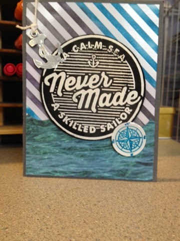
I had so much fun playing with the Irresistibly Yours DSP and also many of my new products that I purchased from the Occasions catalog!
I hope to continue sharing ideas with you in future posts.
If you are interested in purchasing any product, please contact me through this blog or email: Dandyspandy@sbcglobal.net
You can also visit my online store and shop 24/7 at: http://www.stampinup.net/esuite/home/dandyspandy/
Remember: until March 31, during Sale-a-Bration, with each $50 subtotal of your order you get to choose one free product. I'm betting that Irresistibly Yours DSP will be one of your choices!


