Showing posts with label Watercolor. Show all posts

Monday, March 31, 2014

March stamp club cards

By now you've probably seen the post about our "masterpiece" card from March club. I referred to it as that because it took the longest amount of time to make!

We made two other awesome cards as well! Two that can easily be mass-produced!
This card was made using the Circle Thinlit die for the Big Shot, which creates a "flip" card.
Here is a link to an awesome video by Stampin' Up! which shows how to use that the Thinlit and all that comes with it:

The sun was made with a large circle punch and the free banner punch from Sale-a-bration!

The clouds were cut using the Word Bubble framelits:
(shown with the matching Just Sayin' stamps, available in new Occasions catalog)

Finally, we embossed a sentiment from the Sale-a-bration set See Ya Later.

The colors this card are Tempting Turquoise, Pumpkin Pie, Daffodil Delight and Whisper White.

The second card we did was a CASE of another demonstrator, Kay Kalthoff.

It's called a "tiled background", and it was so quick and easy!

First, I had cut out 10 squares of the Watercolor Wonder DSP (Occasions catalog)using my square 1 1/4" punch. Everybody had a different piece of DSP and they all looked terrific!
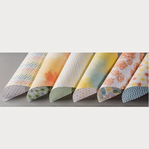
They were glued onto a card of Gumball Green starting with the outer-most corners so that you can judge even spacing. There are no squares in the middle of the card - only around the edges.

Next, on a piece of white card stock, we stamped the Blessed Easter single, wood stamp using black StazOn ink.

Not wanting to color in the tulips, we used the "wash" from the Happy Watercolor stamp set (Occasions) in Daffodil Delight, Crisp Cantaloupe and Gumball Green. We stamped "off" each time so that our card received a lighter version of the original ink color.
A piece of Gumball Green stitched ribbon and a few gold sequins were added to complete the look!

Once we glued that to the front of the card, we added a piece of white card stock trimmed with matching DSP to the inside so that we could easily write a message!


We have a great time at our monthly stamp clubs, - learning new techniques, using current Stampin' Up! products and enjoying each other's company! 

Clubs are made up of five participants and run for five consecutive months. Each participant has the one-time opportunity to receive the free hostess benefits of the workshop order placed at the club.

New clubs are forming all the time!

Contact me if interested!

Sunday, February 23, 2014

Watercolor notecards

In every mini catalog Stampin' Up! comes out with at least one collection that I absolutely love. For the current Occasions mini catalog it is the watercolor collection: The Happy Watercolor stamp set, the Watercolor Wonder Notecards, the Designer Series Paper, the washi tape, the Fancy Foil vellum....

You have already seen a couple cards that I have made with the Happy Watercolor stamp set. Now let me show you a few that I have made with the Designer Notecard and Envelope set.

I surprised myself when I bought these. You see, I usually "boycott" notecards (and by boycott, I mean avoid) .... I don't know why. Are they hard to send through the mail or something? Do I feel that you have to hand them to people instead of mail them? Is it just because they are smaller in size? I don't know! How discriminatory!

It's kind of like how I don't buy anything that is French - like, if we have a stamp set that has the Eiffel Tower or French words - I usually won't buy it. I don't have anything against the French. But I am a Spanish teacher for goodness sake! So as  stylish as it may be, it's not happening.  (I have a similar hang up with realistic looking Mary and Joseph stamps at Christmas time. How do you know that's what they looked like?)

Silly, I know.

But, this time I ventured outside of "my box" and bought the notecards! ...And they didn't disappoint!

Not only were they pretty prints on watercolor paper, you get 20 cards and envelopes in the pack. That's a lot! There are five different designs and you get four  of each of the designs!

So, I set out yesterday to use them. I broke the pack open and again it crossed my mind - can you send these, or do you have to hand them to someone? 

The answer is yes you can mail them! Again, no idea why I had that idea in my head in the first place! 

So, anyway, yesterday I pulled them out  (not being able to mail them in mind) and I set out making a set of cards to hand someone - namely my husband. "Love notes" if you will, that I could periodically  leave on the table for him in the morning before he goes to work. He really does so much for us, and it is nice to be  thanked with a card. I make cards for everyone else - why not give him a card for no other reason than to let him know that I am thinking about him? Shame on me for not doing this more often all along.

So here are the four cards that I came up with:
One was inspired by our Stampin' Success magazine. Others are combinations of things that I have seenby  other demonstrators. I did not use the fifth design of the package (the rose).  I already had one card with flowers on it and that was pushing it! These cards are being given to a man, after all!

I had a particular method in mind when I made that flower card, though - using the Petite Petals punch in the center of the watercolor flowers of the designer series paper. 
It was a good tip shared on Pinterest. Just use that flowered paper and punch out the center of the flowers to get the more saturated color, but yet still get that watercolor look.

I also used the envelope liner framelits. Silly me! Because I don't usually make notecards (or those smaller 3 x 3 gift cards) I forget that they are included in that framlit set!
There they are! Same place as always!

I rarely cut out the whole envelope liners though. I save paper by only cutting out really what you can see when you open the envelope - the flap and a little bit past the envelope crease. 

There are so many things that I bet you can come up with! I know that in the future when I need a quick card I will have these on hand to finish. In fact, I have so many ideas already, I may just go ahead and make up bunch!

Try these for yourself and you'll see what I mean!

You'll find the Watercolor Wonder Designer note card set on page 22 three occasions Mini catalog.

Browse the mini catalog and more when you visit my website and click on "shop" in the upper right-hand corner:

Don't forget that when you spend $50 (until the end of March) you can choose something for free from the Sale-a-bration mini catalog!

Monday, February 17, 2014

More Happy Watercolor

 As I mentioned in a previous post, I love the Happy Watercolor stamp set that is in the Occasions mini catalog! 


I've been "pinning" samples of this set on my Pinterest page since it came out. I knew that I had to copy some of the cards to have for myself - I love them so much! That's what we call CASEing - to CASE a sample is to "copy and steal everything". It is a practice that is encouraged in the stamping world! 

Sometimes you out and out copy a creation - you like everything about it and you're lucky enough to own everything to re-create it (isn't imitation a form of flattery?) Other times you copy an element or two from the card - the layout, the colors, etc., and put your own twist on it.

Either way, it is okay to do it - just be sure to give the original artist credit if you can!

These two cards are almost exact copies of those I saw. I changed a couple of things, but they very closely resemble the originals.

The original artist of this card is a demonstrator named Lyssa Griffin Zwolanek.
All of the ink colors are from the brights collection except the green "in color". I double-stamped (stamped "off") the "wash" stamp so a lighter version of the original, saturated color was achieved. The colors I used, from top to bottom are: Melon Mambo, Pumpkin Pie, Daffodil Delight, Gumball Green and Tempting Turquoise. The card is Tempting Turquoise.

I used the Bitty Butterfly punch in the same colors of card stock, adhered them with Dimensionals, and added a Candy Dot from the Brights collection to the center of each butterfly. 

I stamped the sentiment with Basic Black ink, including a "thank you" on the inside.  Quick and easy, the rainbow card was finished!

------
This is a CASE of a card by Mary Brown. 

Here is the second flower from the same stamp set. It is a line-image stamp like the poppy (on a previous post), but I used a black marker and colored it all in to achieve a silhouette look. Don't forget that you can do this with any stamp just to change it up a bit!

Of course I used the "wash" stamp as a background (It's my favorite, can you tell?) The sentiment is from the hostess set, Simply Sketched

The card base, ribbon, and "wash"  stamp ink are all Simply Starfruit - an "in color" that will only be around until June 1. Be sure to purchase your ink refill and extra card stock before it is discontinued!

I also used the "lace" embossing folder from Delicate Designs to embellish the card. 

The finishing touch was a spray of Gold Glow Smooch Spritz. 

You can find the Happy Watercolor stamp set in the Occasions mini catalog. You can view that, along with the main catalog and the Sale-a-bration mini online at my website:

Reminder: When you spend $50 from now until the end of March you get to choose something free from the Sale-a-bration mini! Don't miss out on the extra value!


Wednesday, February 12, 2014

I finally got new stuff!

I didn't preorder anything this year from the Occasions Mini or Sale-a-bration catalogs like I normally do. This year, I had to wait until the end of January to place an order (gut-wrenching!) - so I'm a little late on showing you new things. 

BUT, my first shipment  arrived yesterday.  Now it's like Christmas all over again! I'm so excited to share with you what I have so far.

One of my favorite stamp sets from the Occasions Mini catalog is called Happy Watercolor. It has two flowers, sentiments, and stamps that look like you applied a watercolor "wash":
I love this set! I especially love that stamp that looks like watercolor wash!

Here is a card that I made that shows that particular stamp used as the background.
I stamped it in Pistachio Pudding and Pool Party. Then, I stamped the flower in black StazOn ink. I used ink pads and a blender pen to color. The colors are: Crisp Cantaloupe, Calypso Coral, Pink Pirouette and Primrose Petals.

I stamped the flower two more times on white card stock, colored them and cut them out. I adhered them with Dimensionals to get a 3-D effect.
This technique is called "3-D Paper Piercing". Here is the page from the technique-book class I offer (DSU) that explains paper piecing:
Can you see that the snowman's hat and scarf are a patterned paper? The snowman was stamped on the blue paper and I just followed the lines to cut out, and glued them right on top of the snowman that I had stamped on the white paper. 

On my flower card I did not use patterned paper but the technique is still the same. By adding Dimensionals to each layer, now the name changes to "3-D Paper Piecing". Cool!

This card also features the Fancy Foil vellum in gold, the gold baker's twine and the gold foil sheets -  all available in the Occasions Mini catalog.

The mini catalog also features new fringe scissors. I do not own them. I guess it would be a lot easier to do this fringe in one fell swoop then to cut them individually like I did!

This card is a CASE, of sorts. I combined a couple of different elements from several cards that I saw. The layout itself came from my card seen on Pinterest by Billie Moan. The dimensional flower idea was from a different demonstrator - Heidi Baks.
---------
On that card, you saw how I used the "wash" stamp as a background and colored the flower.  But, what if I don't feel like coloring? That's what's awesome about this particular stamp - you can use it to color an image as well!
I just added a little glitter and, presto! - it was done.

Two more new products were used on this card: The Decorative Dots embossing folder for the Big Shot (FREE with a $50 purchase!) and the Watercolor  Wonder Designer Series Paper.

In case you're wondering - the colors are Island Indigo and Gumball Green. This card is in that CASE of a card by Michelle Humphreys.

Love, love, love, playing with my new goodies!

More to come soon!
-------

The Occasions mini is in effect until June 1.

Sale-a-bration, our annual special, runs until the end of March. With every $50 that you spend, you can choose one free item from the Sale-a-bration brochure!

You can check them out online! Just visit my website and click on "shop":
http://www.stampinup.net/esuite/home/dandyspandy/ 

Wednesday, January 29, 2014

January Stamp Club card #2


Whitewash Watercolor Technique

I loved everything about this card when I saw it! It is a CASE'd card - but I don't even know from whom anymore. Sorry!

I loved the colors, I loved the technique, I loved the paper, -  the whole shebang!   I'm happy, too, that both stamp clubs loved it as much as I did!

The card is made primarily of the colors Night of Navy and Gumball Green. (Reminder: If you are a fan of Gumball Green it will only be around until June! It is an "in color" from 2012 - 2013 and will be retired since it has been with us for two years. So, stock up now on ink pad refills, ribbon and card stock!)

The card measures 4 1/4 x 11, and we folded it in half at 5 1/2. We then opened the card up and cut the front flap in half at 2 3/4".

The Designer Series Paper is from a retired paper stack - that was glued on next. The Gumball Green stitched ribbon is wrapped all the way around the card and tacked down with adhesive.

We stamped a greeting from the stamp set Sassy Salutations onto Very Vanilla card stock. That was then layered onto a slightly larger piece of Gumball Green card stock. We also glued a Very Vanilla postcard on the inside of the card.

Doing the flowers was the fun part! We used the flowers and leaves from the Secret Garden stamp set. I have been wanting to try the technique called "whitewashing watercolor", and it works perfectly with this stamp set!

Here's what you do: (Son's video camera broken - so a picture tutorial will have to do!)

* Stamp image in VersaMark ink or white craft pad.  (We used Crumb Cake card stock) Sprinkle with white emboss powder and heat emboss.


* Drip white craft ink refill into pad lid or  other plastic container.

* Use aqua painter to "whitewash" (cover the whole image white). Do not squeeze your aqua painter! Don't worry about the image lines - just cover the whole thing white.

* When dry, apply lines of color with a marker -you do not have to color the whole image! Using your aqua painter, (Do not squeeze it !) blend the color from the lines.  As soon as the wet paintbrush hits the marker line, it spreads out! Instant artist! 

You can always go back and add more color and re-blend for more shading.

Don't worry about blending over the image lines. They are embossed, remember? Those lines are going to resist all of the ink application! 

Oh! PS: The middle of the flower was just colored in with Crushed Curry and Daffodil Delight markers - nothing fancy -no blending.

The beauty of this technique is that putting the whitewash down first does two things:
a) It enables you to add color to even dark card stock!
b) Even after adding more color and blending with more water from aqua painter, the card stock does not "pill"! (Did you ever have that happen when you blended something with a blender pen too much and the paper gets too wet and little balls of paper form?)

** After applying the whitewash it must be dry before adding marker. You can speed up the process by using a heat gun, but be careful not to overheat, causing you to "deflate" your image lines.

Flowers and leaves were cut out using the matching Secret Garden framelits  for the Big Shot. (Thank goodness for the magnetic platform on this one!)

Glue them all on, popping up the center flower. Tie the card shut with ribbon, and you're good to go!

One of the videos I viewed said that you could also use a blender pen for this technique. I tried it but did not have good luck, so I stuck to my aqua painters. You don't need too much water - that is why keep repeating not to squeeze them!

You can find everything you need to make this card on my Stampin' Up! website!

And click "shop" at the top.

Any questions?
I'm happy to help you!


Thursday, January 16, 2014

I changed my mind...

I needed a baby boy card for someone. When I woke up I had thought about a card, so of course I had to go down to my stamp room, make it and put the other one back in the "stash"!

Here is the one that I decided to send this time:
                
I am so happy with the results! I had this single stamp called Two by Two (now retired) down on my shelf and I've never used it. I have loaned it out to be used but I, myself, have never used it. I'm happy that I finally have the opportunity - it's awesome!

The main image is stamped in black Staz On ink on watercolor paper. I used a blender pen with my ink pads to watercolor the image. It's one of my favorite ways to color! With the ink pad closed, you squeeze it a few times so that the ink pad inside touches the case. By doing so you get some ink on the bottom of the case. Then you use that as your ink palette and use the blender pen as your paintbrush. You don't want to take ink directly from the pad because it sucks up too much of the ink!


Coloring this was is easy! You can layer the colors for darker shades once the image is dry. An image like this or has built-in "shade lines", so I just made sure that I put darker ink in those areas. I used many complementary shades, for example: So Saffron with Crushed Curry, Soft Sky with Marina Mist, etc. (a lighter color with darker color in the same color family). Just be sure to clean your blender pen tip, by swiping it gently on scrap paper, in between each color change.

Also don't forget that you can use blender pens with ink refills,watercolor pencils, watercolor crayons or even our pastels! They come three in a box, each with a double tip, so they will last you a very long time.

Once I got that main image done it was time to put the card together!

I used the dotted embossing folder on the Marina Mist card base. Then I used the wood grain embossing folder on a piece of chocolate chip Core'dinations card stock - that way when I ran it through the Big Shot and then sanded it you could see you lighter color underneath. This is a special card stock. All of our others are dyed all the way through. That's wonderful because if you've ever had a cheaper piece of paper that showed white when you folded it in half you know what I mean!

I used a circle Framelit to cut out my main image and layered it on a piece of Cajun Craze card stock. That was cut out with a Big Shot die called "scallops #2".

I adhered it to the card using dimensionals over a piece of so saffron grosgrain ribbon. This not only popped it up a bit, but I recommend doing so when you have texture on the card or sticking it to ribbon - it's a stronger bond.

For my final step I decided to add the smallest basic pearls to each of the scalloped edges. This was done in a  flash thanks to my new tool called "quick stick" that was given to me by my friend (and stamp club member ) Nancy. 

Thanks again, Nancy!

I think they're going to love this card!

The Core'dinations card stock is part of this week's "weekly special". For this and any other of your Stamping needs please visit my website and the online store: